the modern minimalist kitchen transformation, all for under $3K
I’m so excited to finally share my first kitchen renovation in our modern tiny farmhaus! If you’re looking for budget friendly upgrades while maintaining a minimal aesthetic, you’ve come to the right place.
Inspiration
With every project I start, I begin with a vision board. This kitchen was inspired by the colors I love, and the Sarah Sherman Samuel half moon handles I’ve been lusting over for years. We live in a rental, but luckily the owner was willing to let me lead this redesign. Originally this space was a garage, that was turned into a mother in law suite, however it was left unfinished in the kitchen. Here’s my vision board for the project.
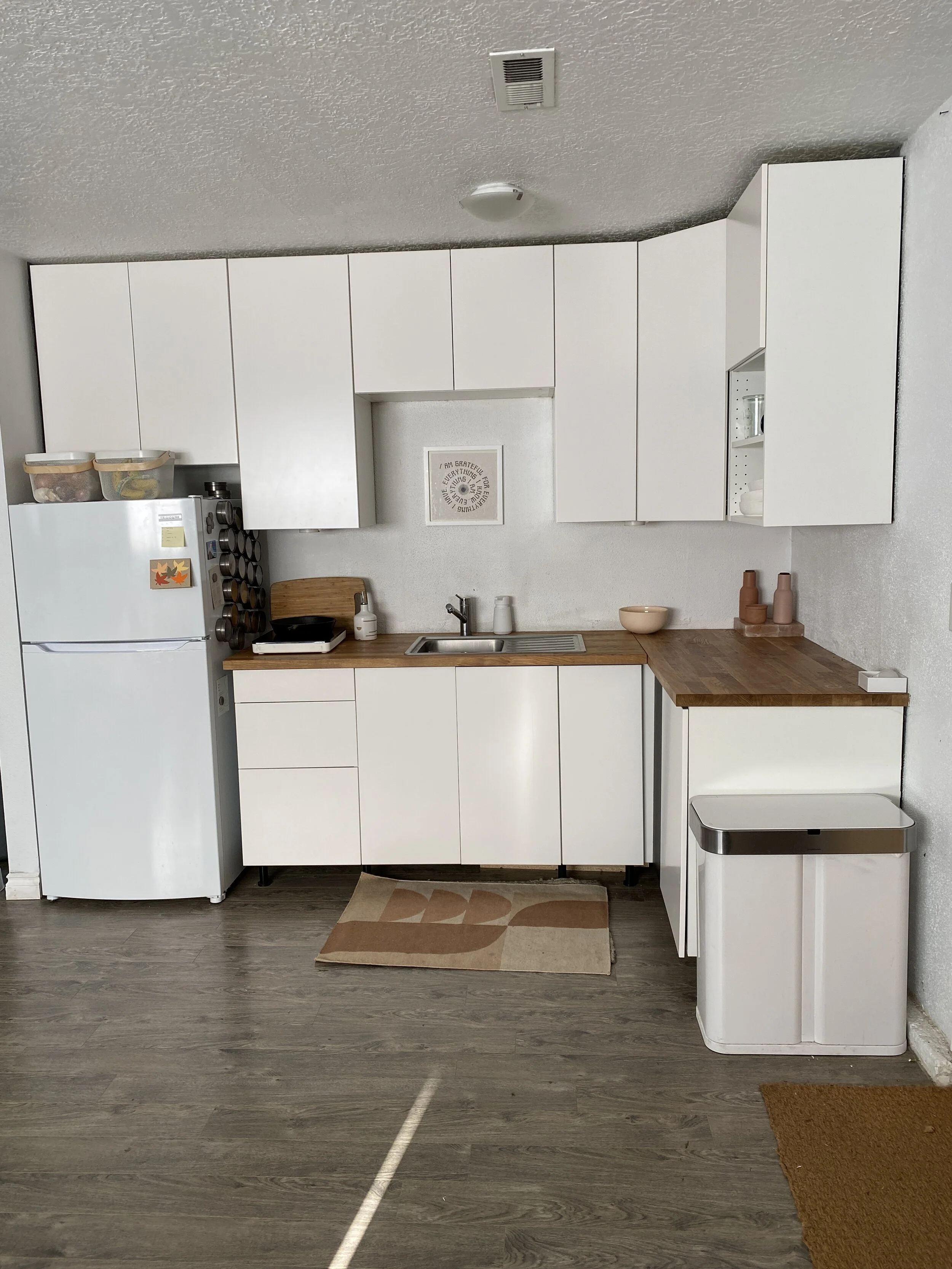
Here’s what the kitchen looked like before the renovation. All black everything from ikea, with super unattractive looking handles. I am not a fan of black in the kitchen, and especially in a small kitchen it made the space feel even smaller. The specific matte finish on the cabinets showed every water mark, so it made cleaning them constantly crucial. We didn’t have enough storage for what we needed, or enough counter space for more than one cook in the kitchen.
What started out as a project just to add a stove, turned into redoing the cabinetry, expanding the kitchen, adding open shelving, mounting the microwave, new hardware and a minimal backsplash + hood detail.
The stove
We started with the stove in November. My dream was to have a retro inspired bisque stove, however in pandemic times, you take what is available. When you’ve been living without a stove for 5 months, you realize how important one is in a kitchen. So we ended up with a simple GE stove, on sale for around $500. In this kitchen there isn’t a ton of extra space, and we played around with different positions on the wall. It couldn’t go against the right wall because of the electric panel, and I didn’t like the aesthetics of it being centered, with how that would break up the open shelving I loved, so we ended up with it next to the door. I want to note that we rarely use this door, so it wasn’t an issue for us.
Design
Next was measurements of the space + a trip to Ikea, that turned into many trips to Ikea. When designing the kitchen extension, being a professional home organizer really became helpful. I knew we needed more space for silverware, kitchen utensils, and pots and pans which would be best in drawers. I also knew we needed space that allowed for easy access to large electrical appliances, and glass food storage and baking materials, so we chose two large base pieces, and a three drawer option.
Cabinetry
We spent alot of time walking through different options. Eventually we ordered the new cabinetry. We went with the white matte line, called veddinge, for all of the cabinet fronts for the existing kitchen, as well as the extension, adding two sektion base cabinets and 3 drawers. I wasn’t a huge fan of ikea’s planning software, but it got the job done and everyone at ikea who assisted us in creating the kitchen was super helpful. We also ordered a new farmhouse style sink, called the Havsen, and a new faucet as well. If I did this project again, I would have chosen a different sink, we’ve had lots of staining issues with this sink I assume due to quality of the sink material.
The full Ikea purchase came out to $1358.
Everything was ordered, with a few items on backorder.
We took home everything for the cabinets a few days later, added the new cabinet fronts to all the existing cabinetry, and assembled the new base cabinets for the extension ourselves. In December we went away for a week while an electrician and handyman did the full install for the cabinets, stove and upgrading electrical for the extension.
Counters
Next stage was to choose the countertops. Originally I liked the birch and white oak options at ikea, but based on availability, pricing and functionality we went with a hevea butcher block from home depot, that way we could use the same material for the counters, and the open shelving. This piece is what we used, in three 8 foot slabs for all of the pieces. We spent around $359 for the butcher block wood. Its a beautiful light wood color that I love, and I really like that everything matches. The handyman had the idea to create a minimal backsplash, also out of the hevea wood, so that we could avoid paying for a tile backsplash. I went back and forth with this decision, but it fits the minimal look we were going for.
After living with the counters for a few months, I’d recommend getting them stained or choosing a different option. Ours are unstained because I really love the light color. Because of this choice, they show everything and have to be cleaned constantly. One of the ways my aesthetic loving brain can get in the way when it comes to functionality, but its a good lesson learned! Our next kitchen will not be featuring butcher block counters.
Open shelving
My inspiration for the open shelving was the Semihandmade floating shelves. Again my vision had to be altered to stay within a budget, so the diy shelving idea was born, using brass L shaped brackets to support the weight, similar to these for $47. Our handyman (who installed everything for us) custom cut the shelves out of an 8 ft slab, and mounted them over the course of a few days.
Hardware
The brass hardware was Sarah Sherman Samuel inspired, specifically the Park Studio collaboration collection. At $30 for each handle, we had to find another option. Luckily Etsy is a treasure trove of budget friendly hardware options, that look spot on the half moon handles I loved. Here’s a similar option to what we used, at around $5 each. We ordered 6 handles for all the drawers, and a minimal brass round knob to match. All in all hardware cost around $157. Again due to pandemic supply issues, we didn’t receive the hardware until two months later, so we got very used to creatively opening our drawers without handles or pulls for a while.
Wood Hood
The next piece of the project was the microwave and hood.
The microwave was sourced by the owner, and I believe it was around $300. There were a few different ideas when it came to the hood, the original plan was a basic white piece from Ikea to serve as the hood, but eventually the micro hood built in underneath the microwave was the best solution.
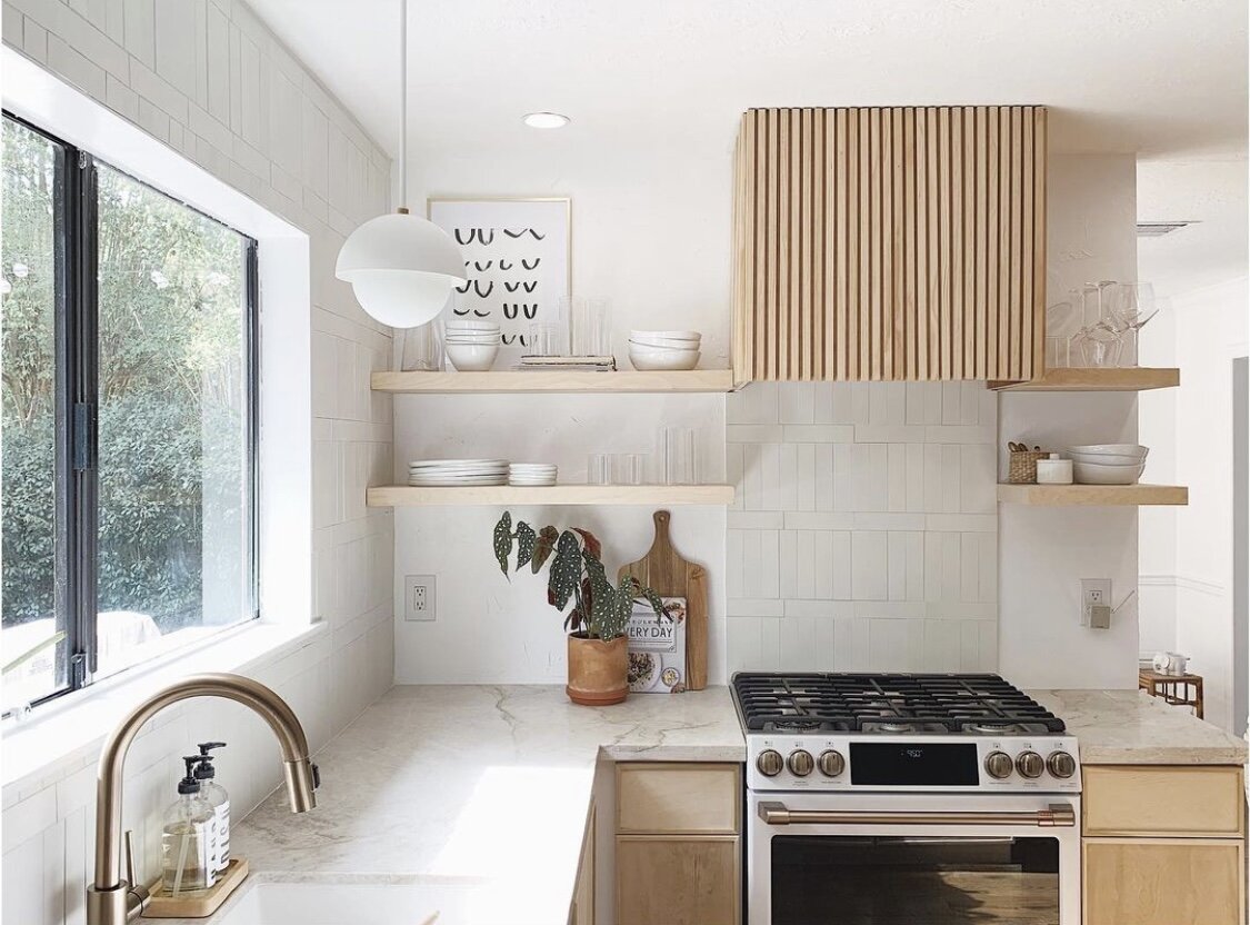
Above the microwave I wanted something as minimal as possible, that would also disguise the cords and top of the microwave from view. After seeing this inspiration from Houston designer, Kayla of Self + space, I wanted to create something unique and more visually interesting.
Once all the cabinetry went in, and before the hardware had arrived we realized how white everything looked. So bringing more wood into the space, with an interesting but minimal design was the perfect touch. It worked out perfectly because we had scrap wood leftover from the counters and open shelving, so we were able to utilize pieces we already had. I gave our handyman photos of the design inspiration, and two weeks later it was in our kitchen!
Lighting
Finally, we added more color with lighting. Lucky for me, I had reached out to local Portland lighting company, Cedar and Moss about opportunities to collaborate. They agreed to gift me these incredible pieces in a brand new peachy ceramic, called shell. Thank you thank you thank you cedar and moss for such incredible generosity! I believe I was the first human to have this color, which is pretty cool. For the existing kitchen space we went with the terra surface, and for the extension, we chose the terra pendant, both in shell and brass. It was important to me to create a separate space for the seated eating area, designated by a pendant light.
A big mistake on my part was understanding literally nothing about lighting. Once we pulled down the old lighting, our handywoman (shoutout to the portland handywoman!) who helped us install the lighting informed us that the light we had chosen wouldn’t work based on the junction box location, but that we could try a swag as an alternative to expensive electrical work to change the location of the junction. A swag simply means ‘an electric ceiling light connected to a wall socket by a cord (usually decorated with a chain) from the outlet up the wall and along the ceiling’. From the research I did, its a $600+ operation to create a new junction, so just buying a swag hook instead seemed like a much better, and cost effective idea.
The swag solution
Luckily Cedar + moss had a corded version of the fixture, and the ability to choose a custom cord length. We went with a white vinyl cord, in 84 inches to make sure we had plenty extra. Getting the new lighting and our swag took about 4 weeks. My initial research for the swag hook at Lowe’s had me concerned at the availability of modern looking swag hook options.
After reaching out to local interior designer Copeland & Co, she recommended a beautiful modern option from Rejuvenation. They make this specific swag in both a loop and a hook version. It’s stunning, so we paid $17 for it (pricey in swag hook terms) and installed it ourselves. I recommend doing lots of testing and measurements before installing the swag, it was a bit more work than we realized, but took about an hour total.
I’m so happy with how everything came together. Before this project I didn’t realize how long what I considered a small project could take, primarily because of shipping times and labor involved that we couldn’t do ourselves. The entire project from planning to installation took from November to March.
Everything takes longer than you think it will, so have patience along the way. It will all be worth your efforts in the end!
All in all, our materials costs $2859, keeping this project just under 3K! This doesn’t include labor costs, and our lighting was gifted so those are things to keep in mind as well.
I hope you found this helpful for your own kitchen renovation dreams. Ready for more kitchen inspo? Check out my blog on 17 sustainable kitchen switches.
Check out more photos of my kitchen, featured in Oregon Home Magazine’s Spring issue here!
Have some design questions of your own? Book a one hour design consult and we can walk though a vision, product suggestions + styling tips for any space in your home!


